The Valassis Digital design team submitted a project idea to redesign our company's logo as part of a quarterly hackathon challenge. Restricted by the two-day-sprint of the hackathon event, we chose to use this session to explain the value of a rebrand and emphasize our design process as well as educate our stakeholders on the possibilities if we were to take on this endeavor with a proper timeline and structure. Below is our presentation built by Bethany Faulkner.
We opened by taking the time to explain that a true redesign process takes time and that the two-day-sprint was merely a creative exercise.
We reminded the stakeholders that any good redesign is backed by research and a well thought out brand brief, which we conveniently had handy from the recent website redesign.
We broke out the characteristics of strong logos and what we wanted the new visual to communicate.
We hit on a few use cases as to why the current logo simply isn't up to par.
Every brand should have a north star statement, and it should be used to guide the visual intent of the brand--this was ours.
We presented some competitors' logo aesthetics.
And we also walked through some that we thought were effective and that were used for inspiration.
With an ode to transparency, we walked the stakeholders through what the process looked like--starting with sketching and ideation.
Our group used a sticky-system to vote and iterate on the options we independently developed.
We showed how sketch ideation and discussion lead to the first round of visual mockups.
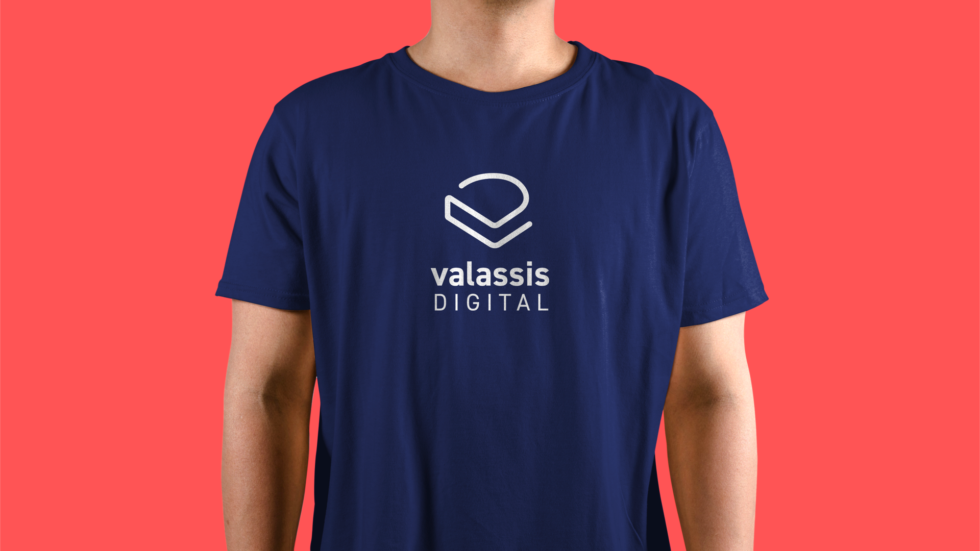
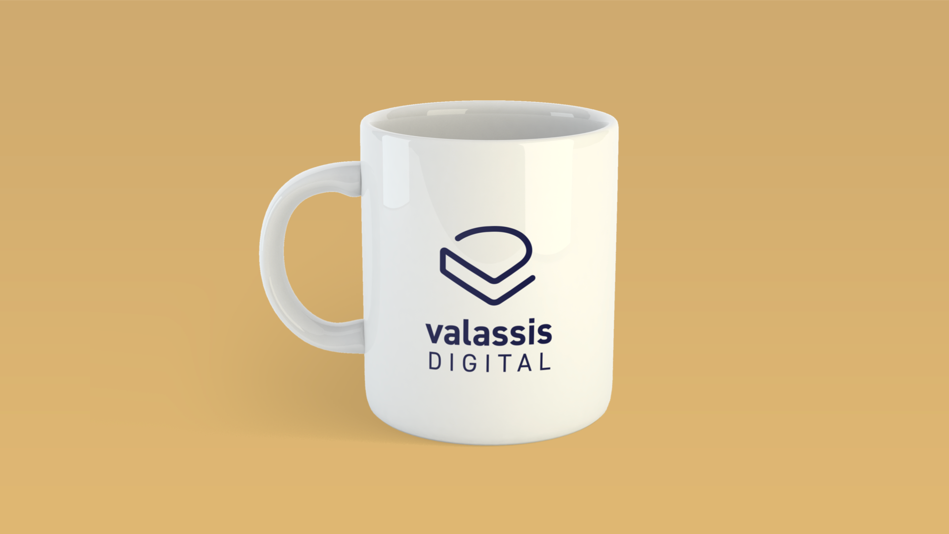
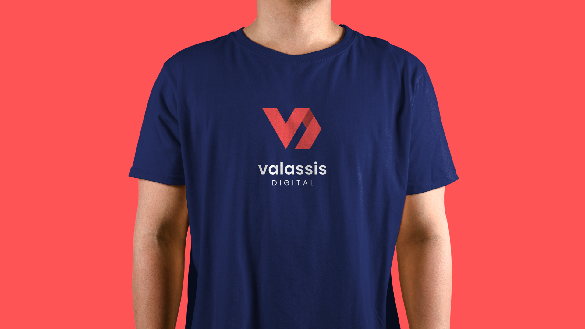
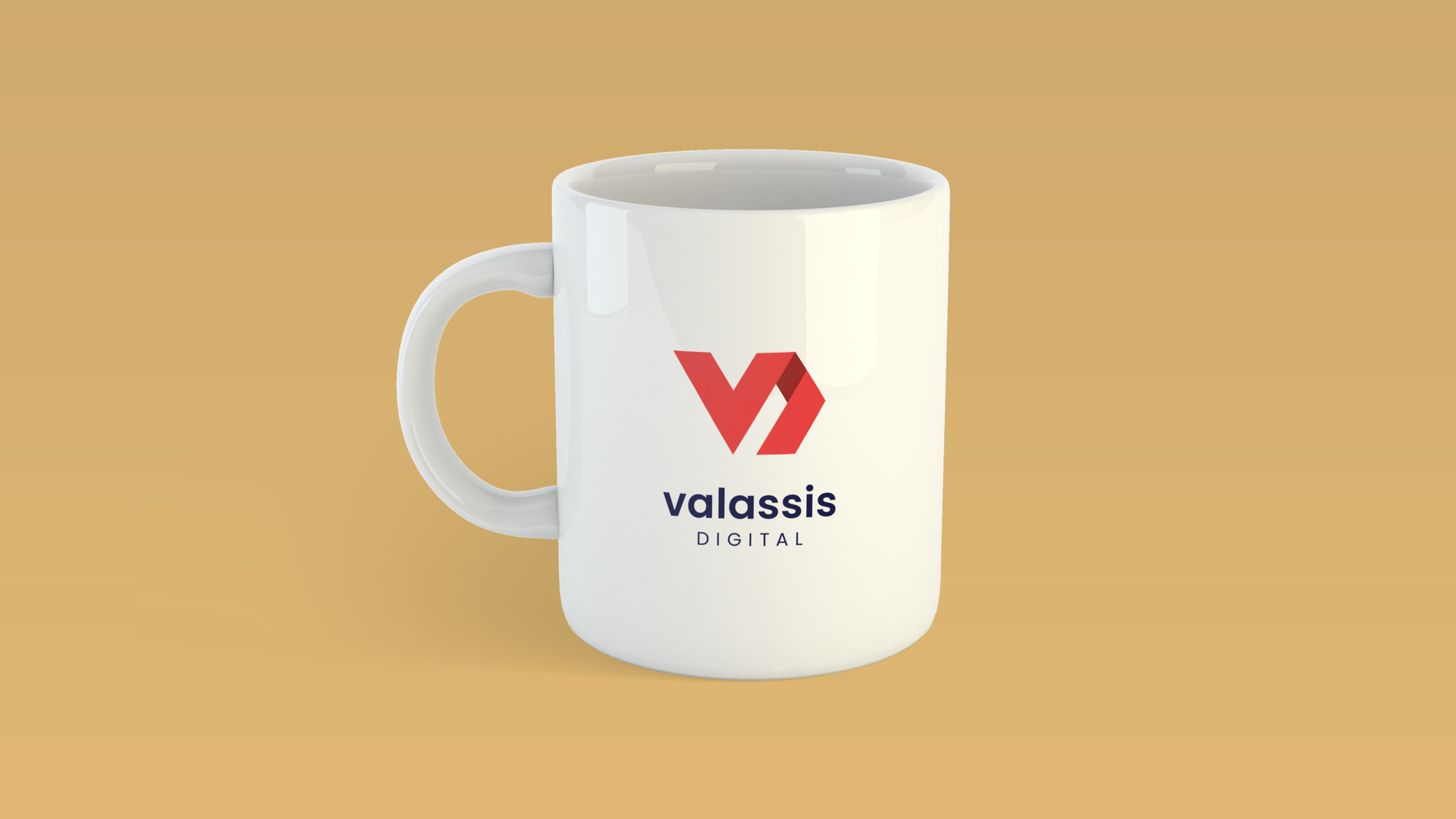
Ultimately, we presented two visual directions that we thought represented Valassis Digital well, both as a technology leader and an innovative company, all while respecting the brand brief and new aesthetic that was previously rolled out via the website and other marketing collateral. We also plugged those comps into a few mockup files to help our stakeholders visualize the implementation of both logos.
