Valassis Digital, previously MaxPoint Interactive, threw a 70s Tennis themed ping pong party to engage legacy clients with the same great services under a new name. We created an event brand to help integrate the theme with a "two is better than one" mantra. Below is a walkthrough of the process and final aesthetic for the event.
Tasked with creating an event brand that paid homage to the 1970s tennis aesthetic but also felt engaging and on-brand, we immediately began dividing up what we saw as three aesthetics of the time period: thick lines, fluff text, and retro type. We also ideated alongside these aesthetics to see how they'd come to life with the copy we were given.
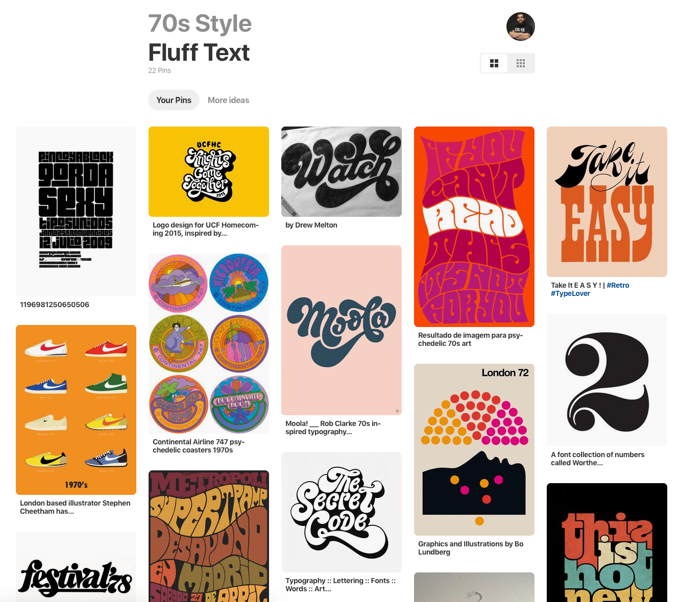
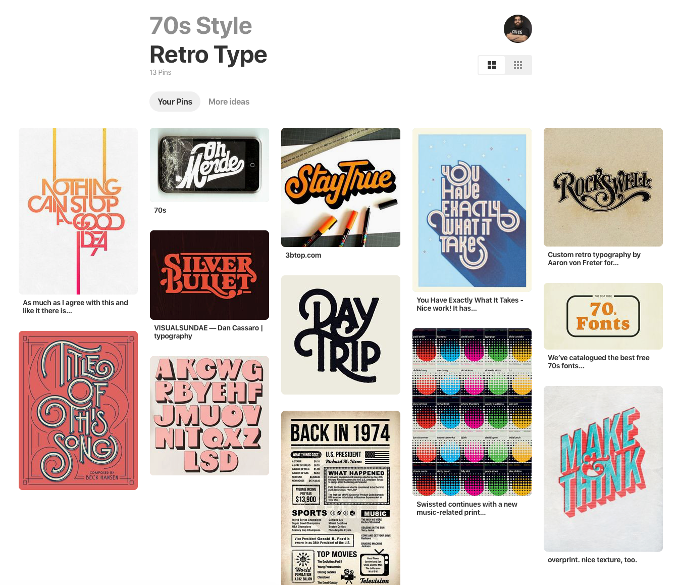
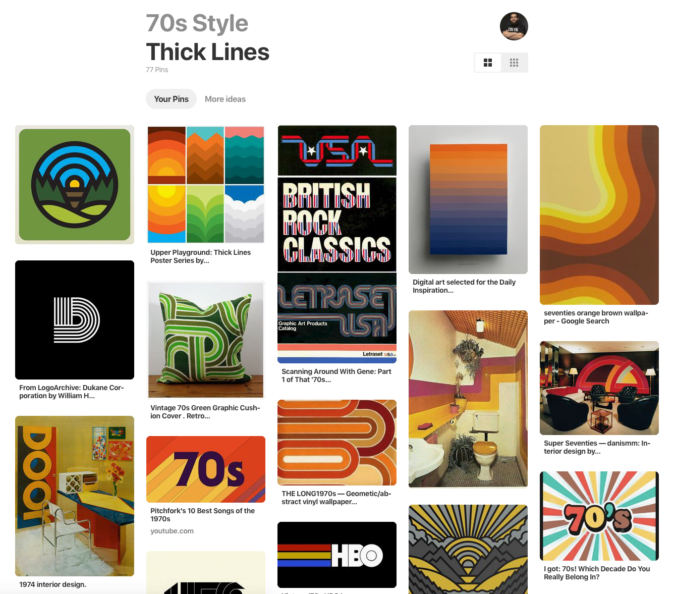
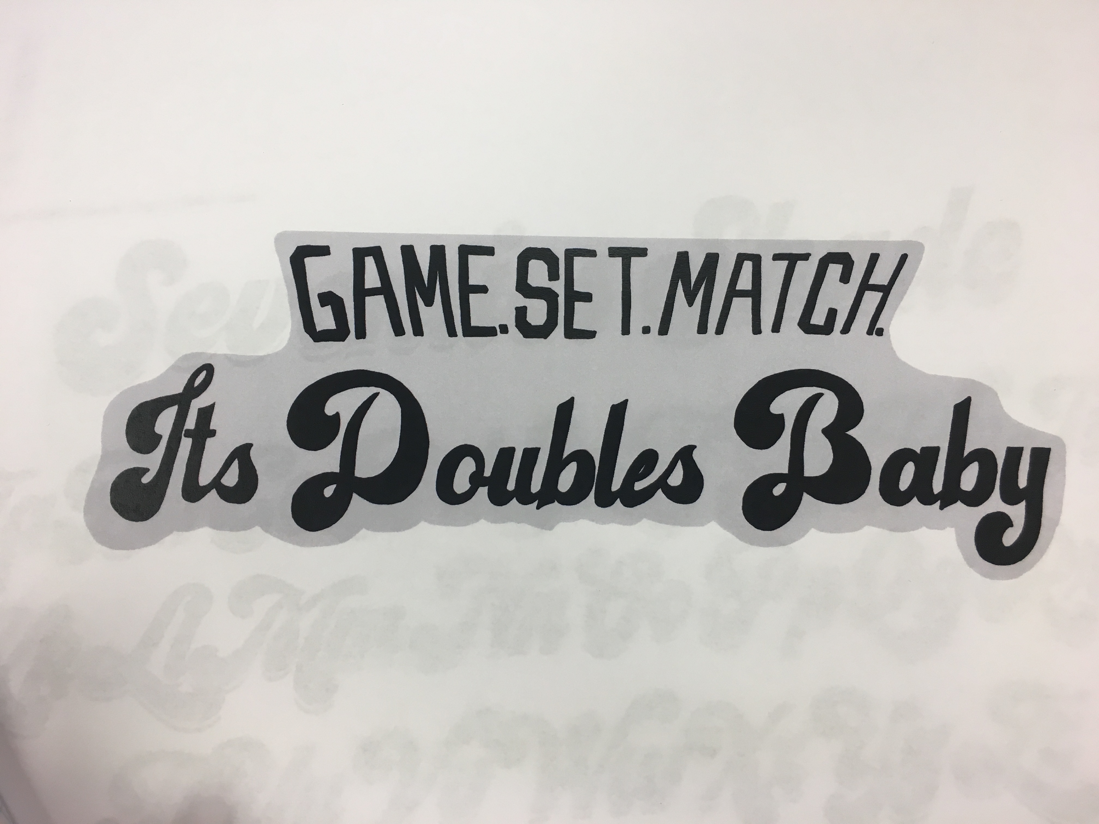
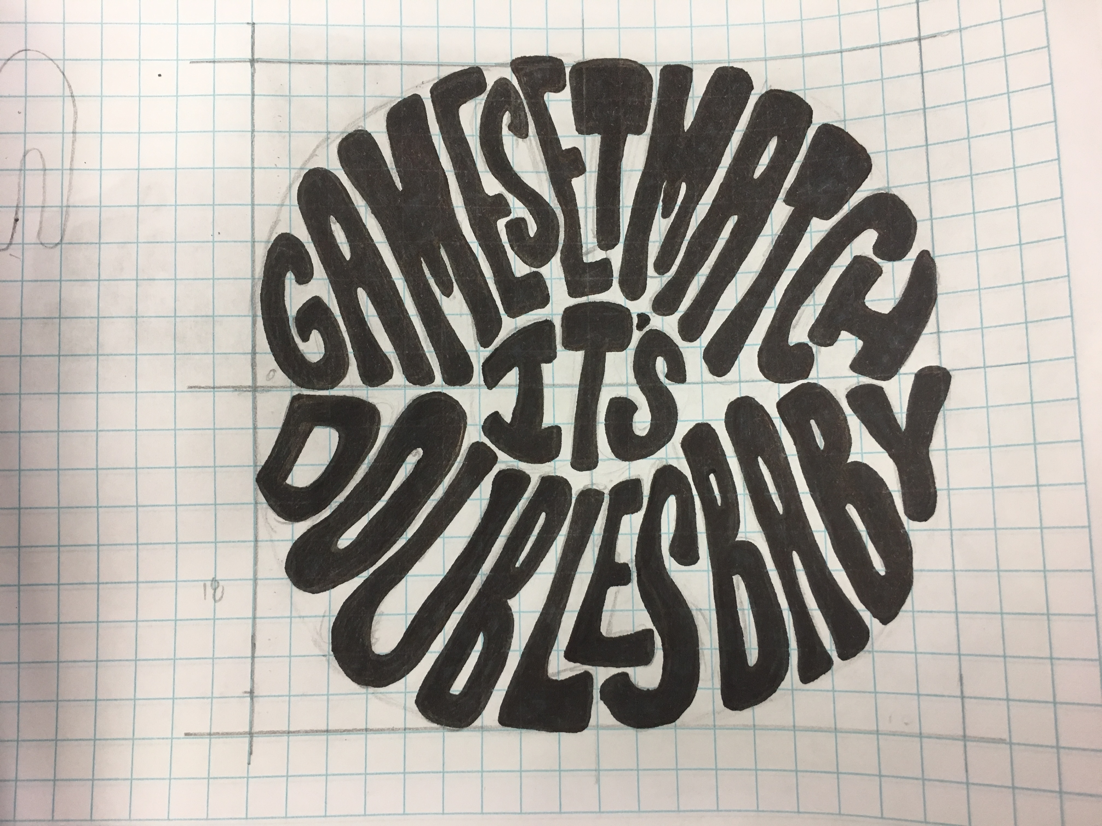
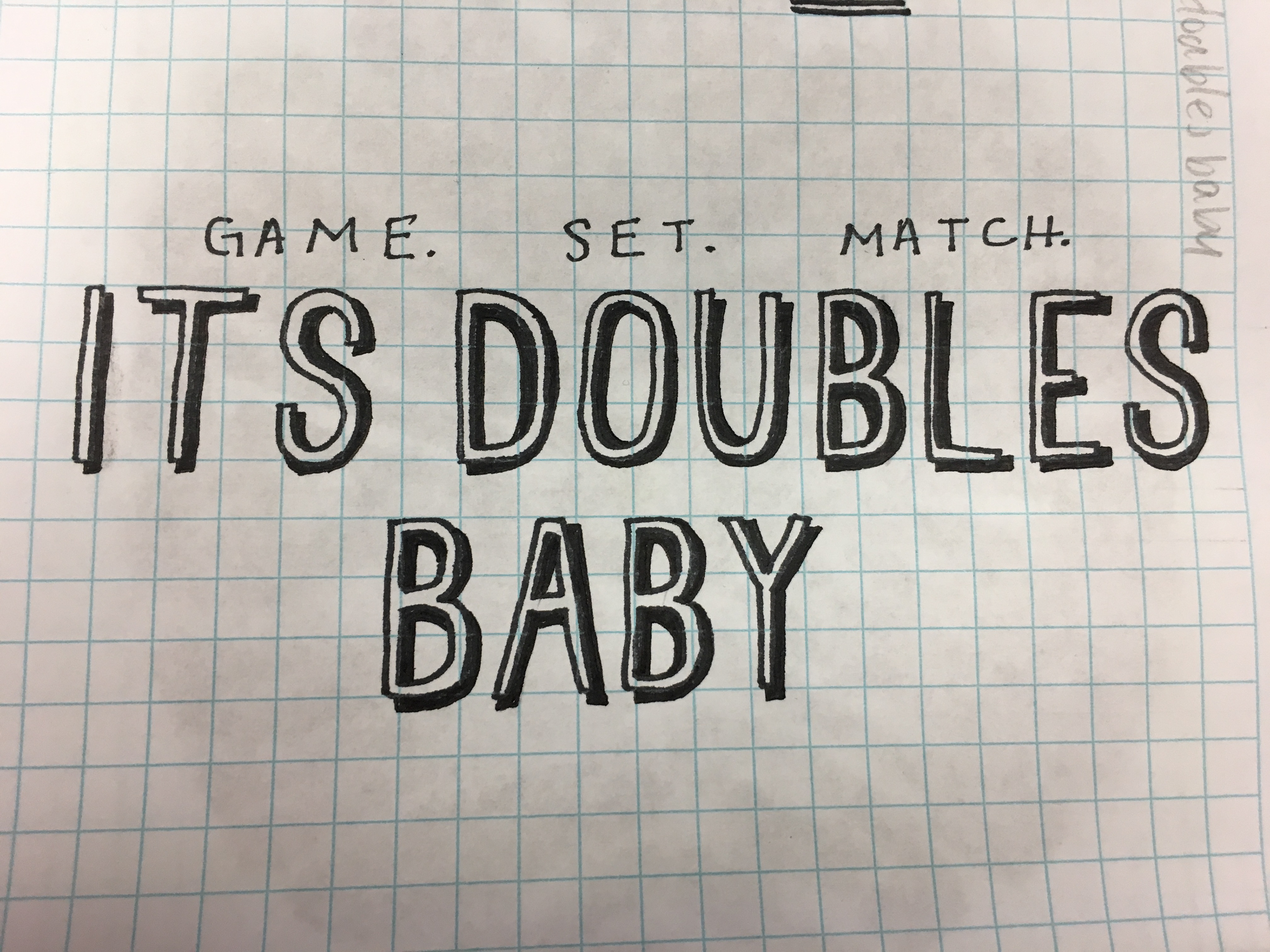
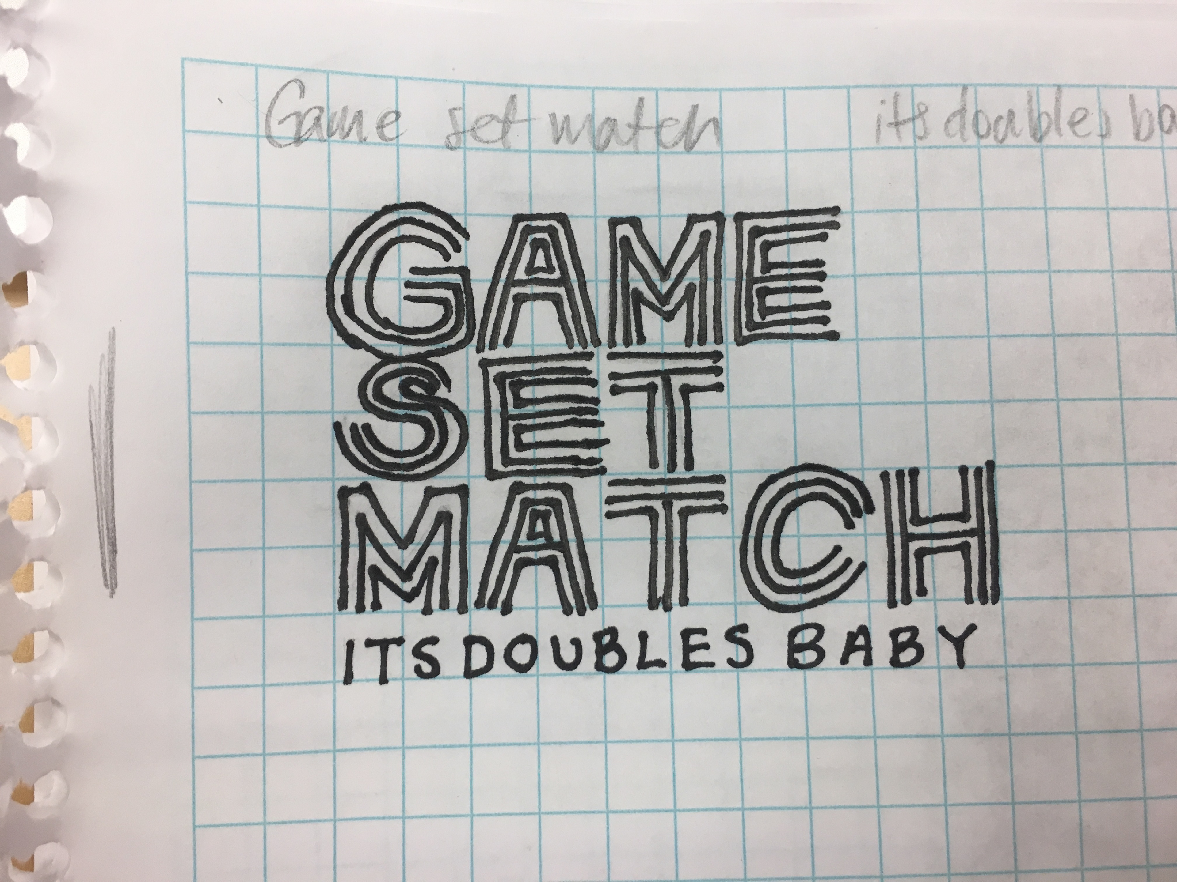
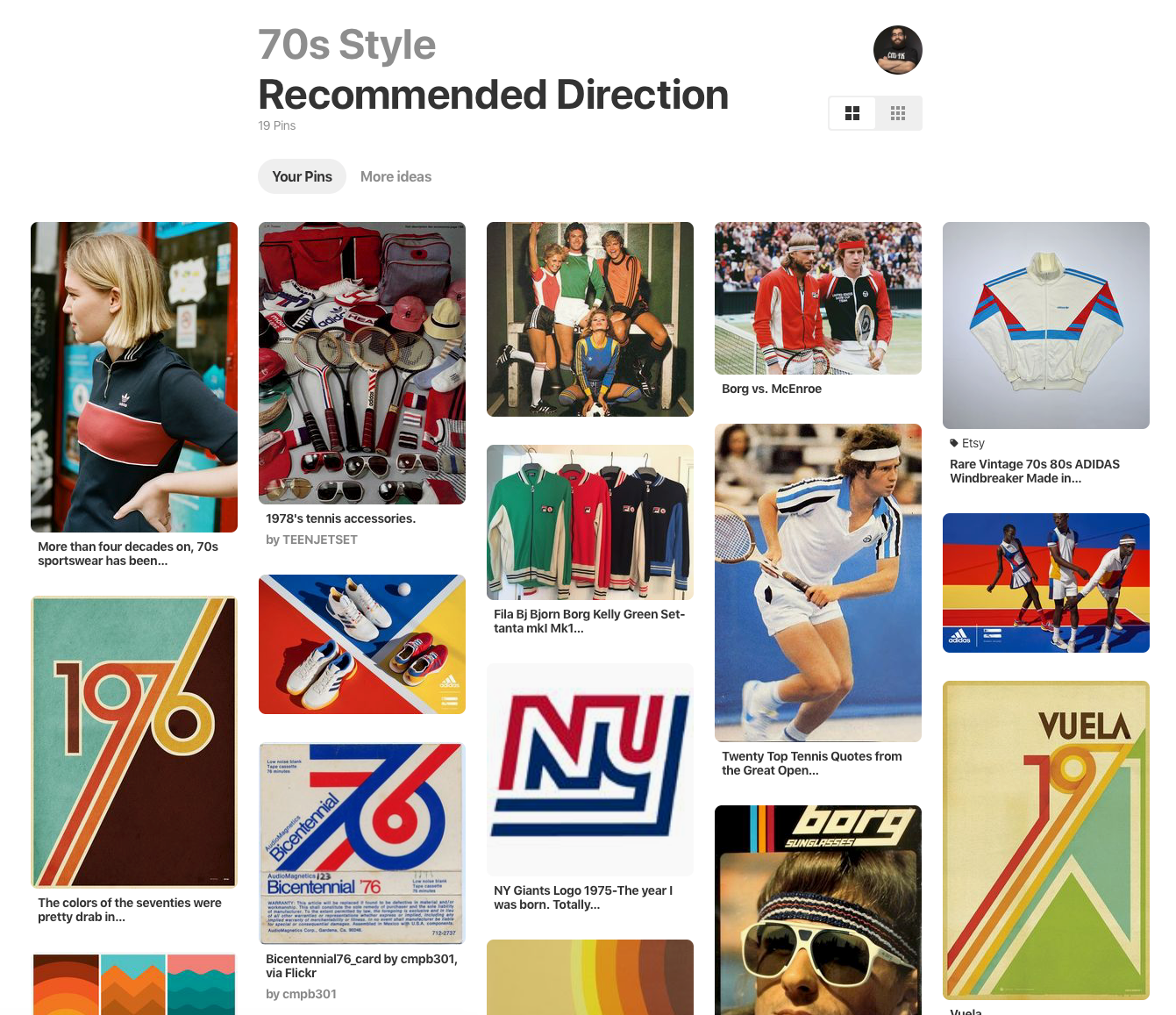
It was clear to us that the fluff text, hippy-esque motif wasn't inline with what we were trying to achieve. A combination of thick lines and retro type, however, seemed promising. So we grouped some items together, did a bit more research, and pitched a recommended direction to stakeholders and they were on board.

From there we jumped into the exploration phase.
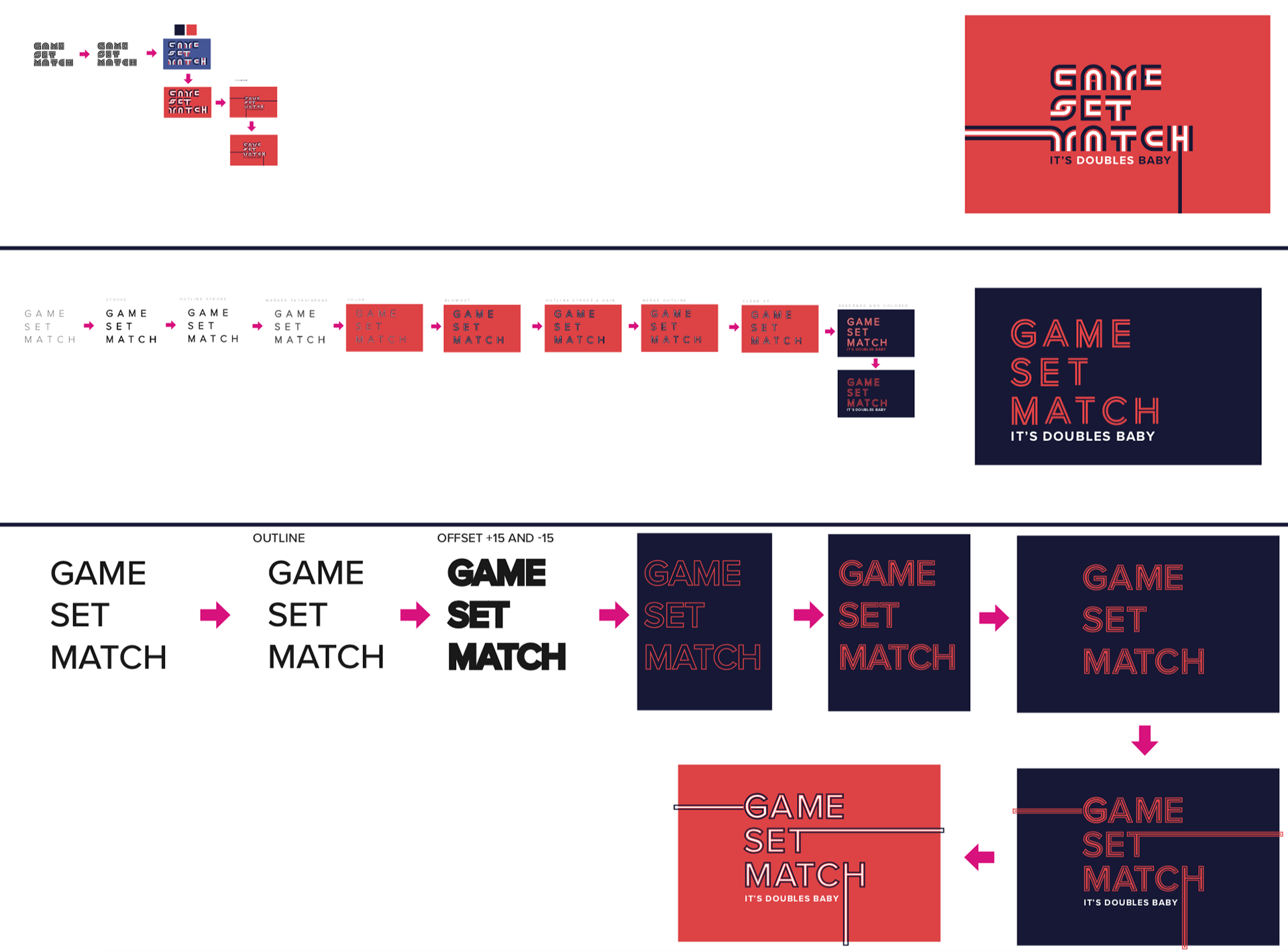
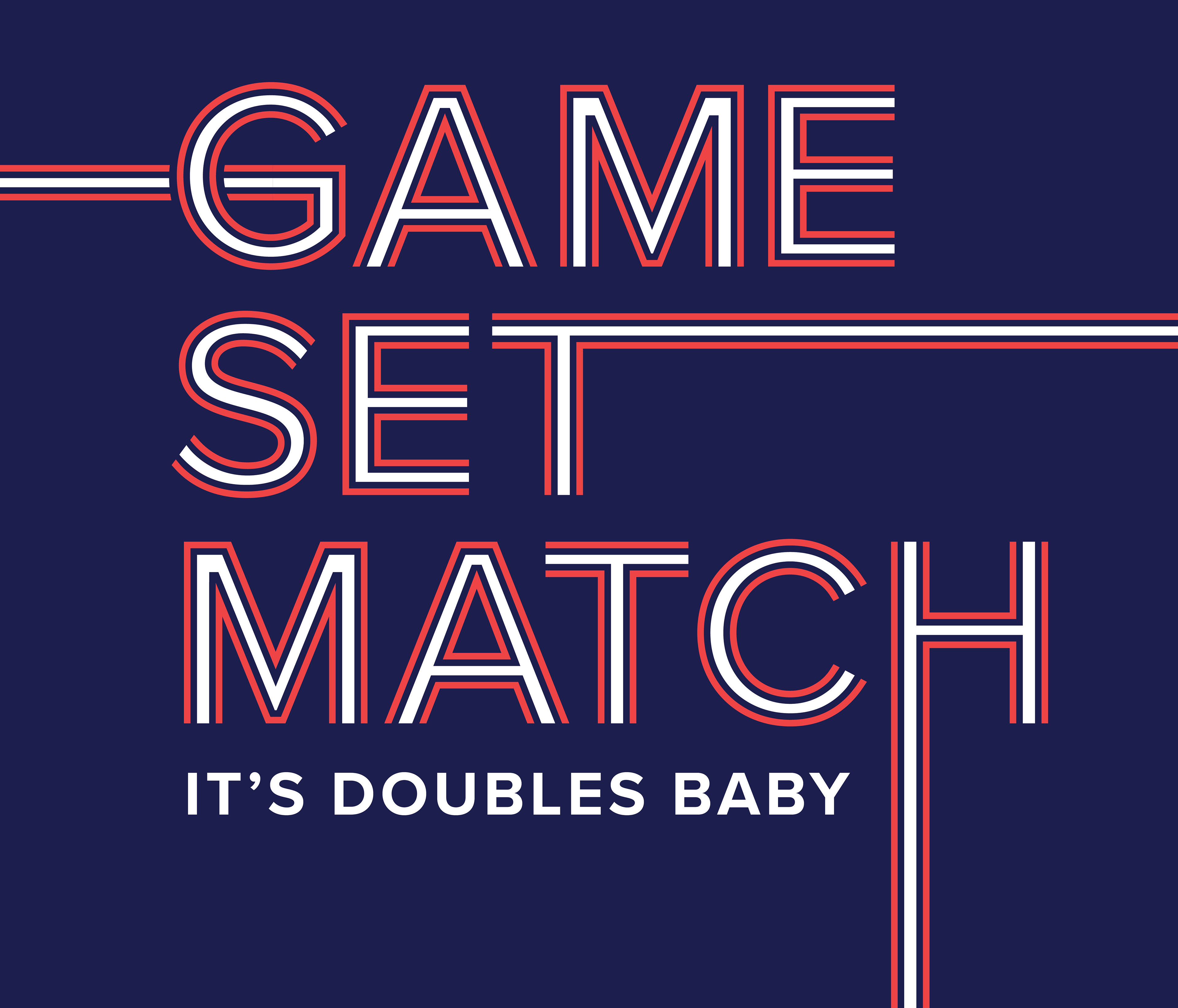
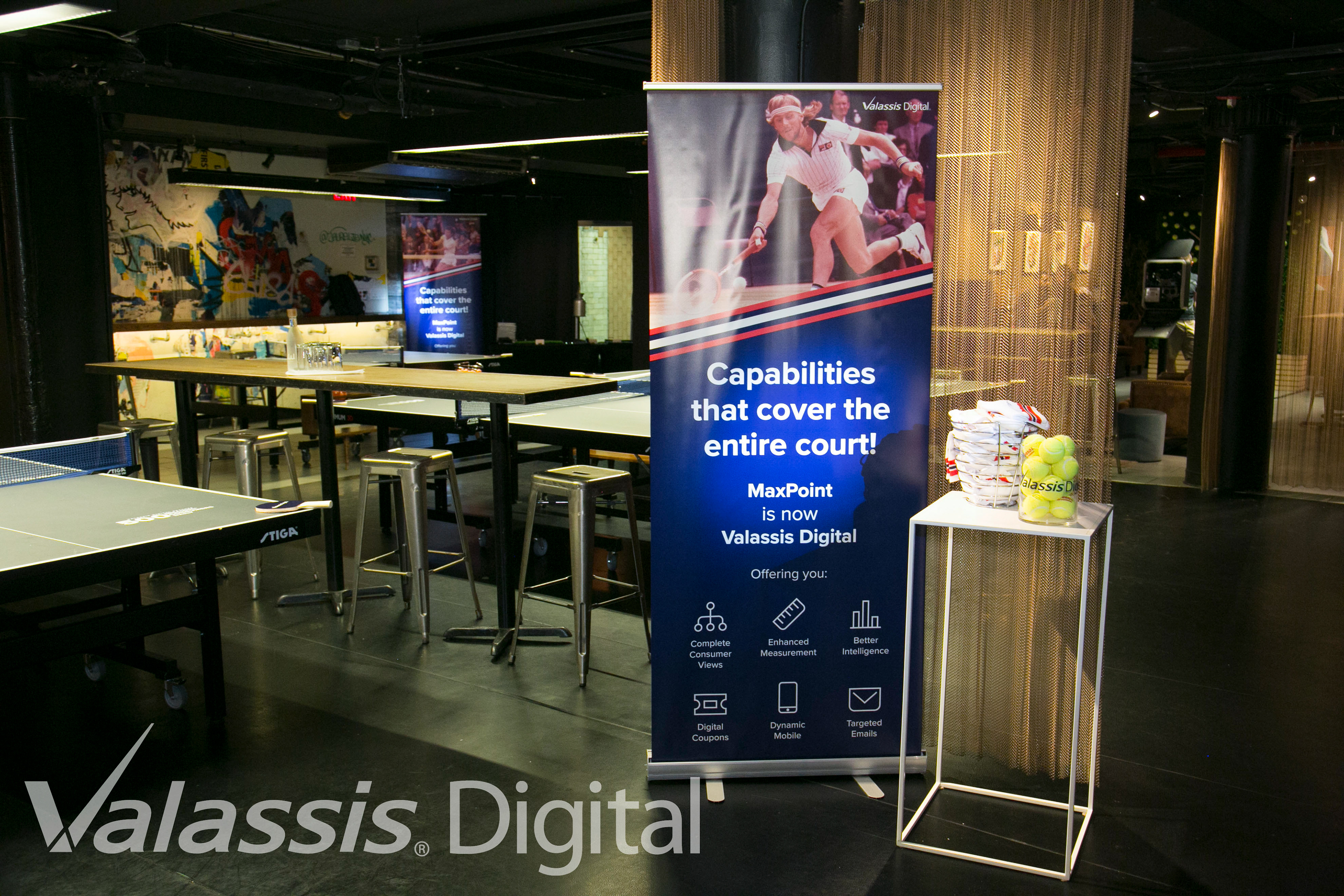
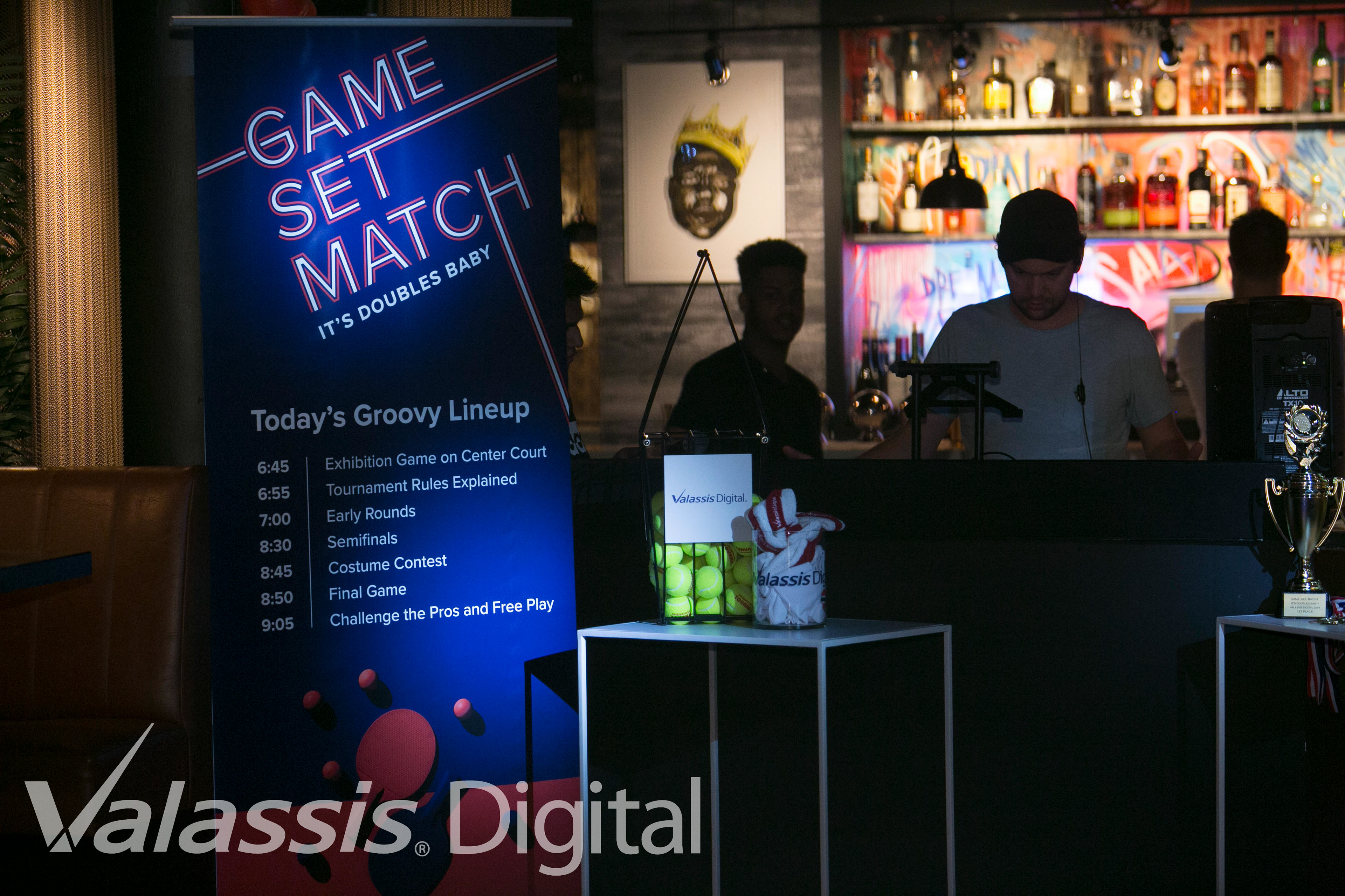
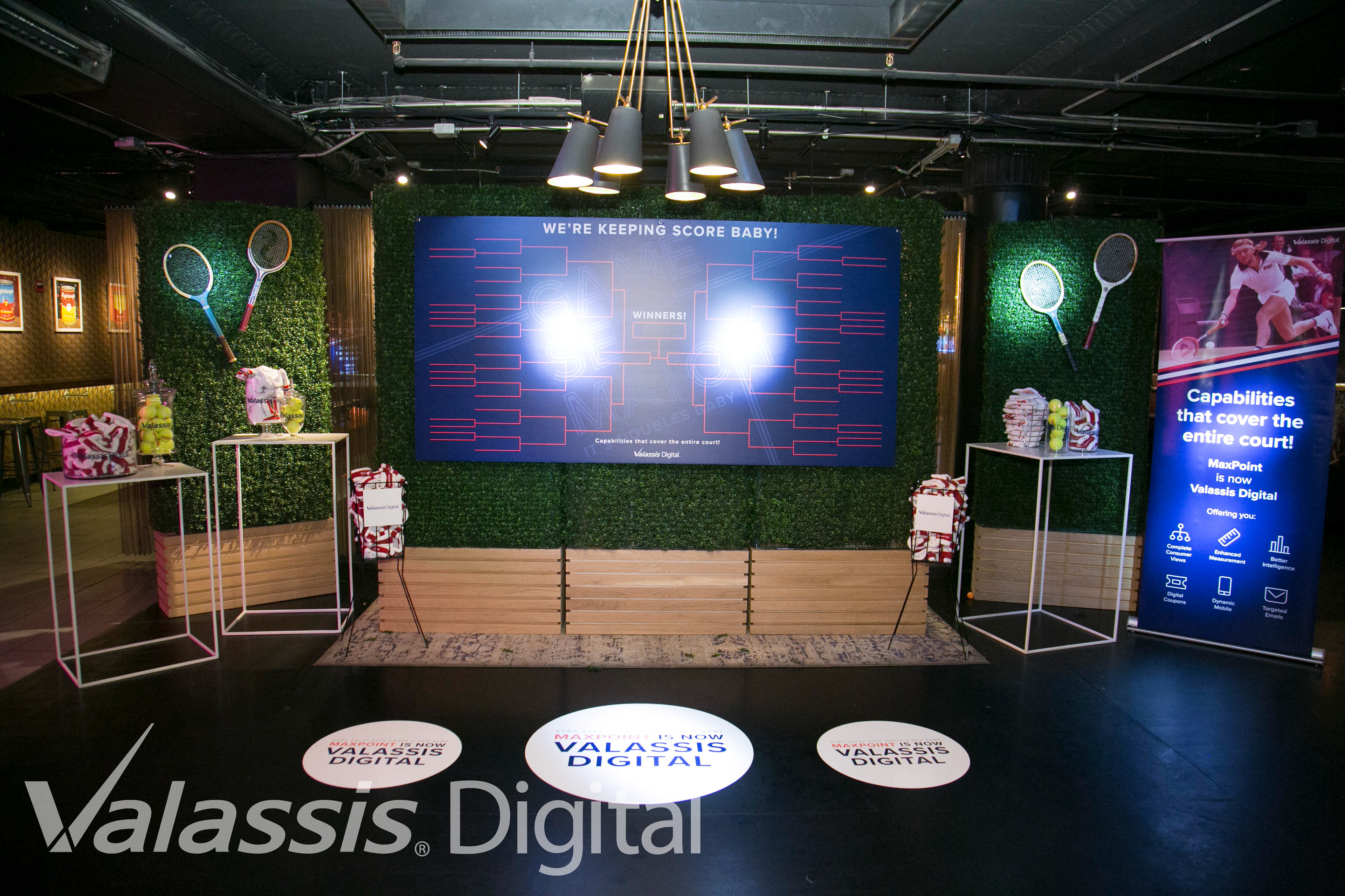
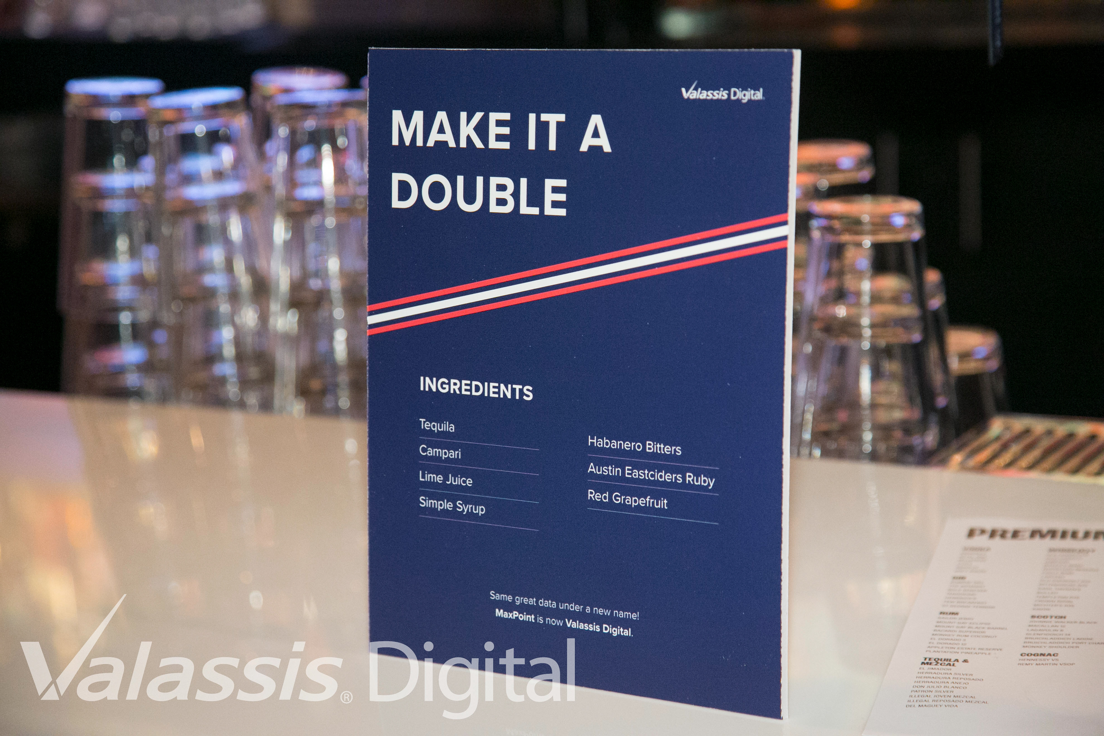
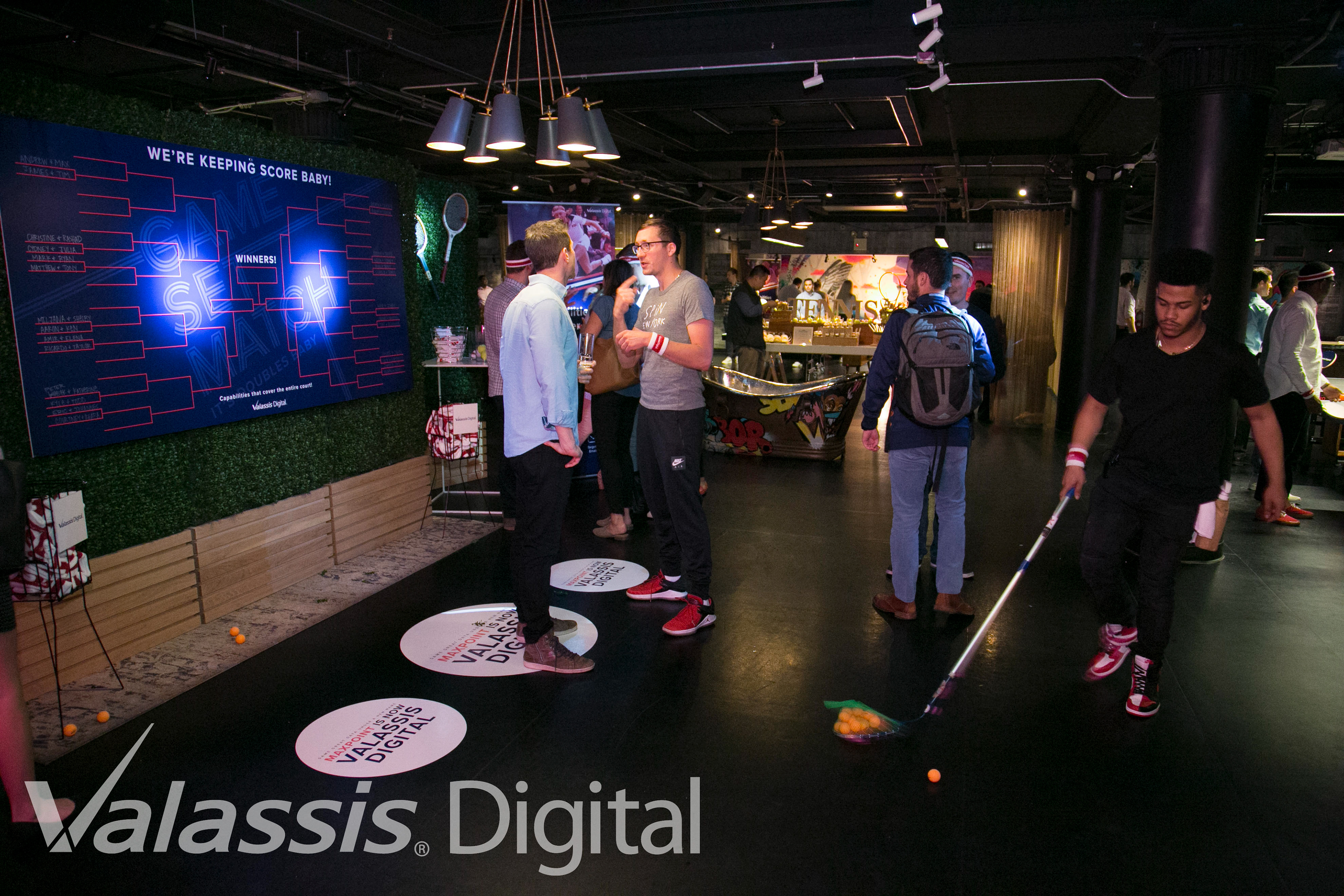
Ultimately landing on the navy-background aesthetic, the color treatment of the bars and type also paid homage to the sportswear of the 1970s. Attendees and Valassis Digital employees arrived sporting retro sportswear and branded sweatbands fully enforcing the theme. Below are the final assets for the event and some shots of the space.
Email Banner Image
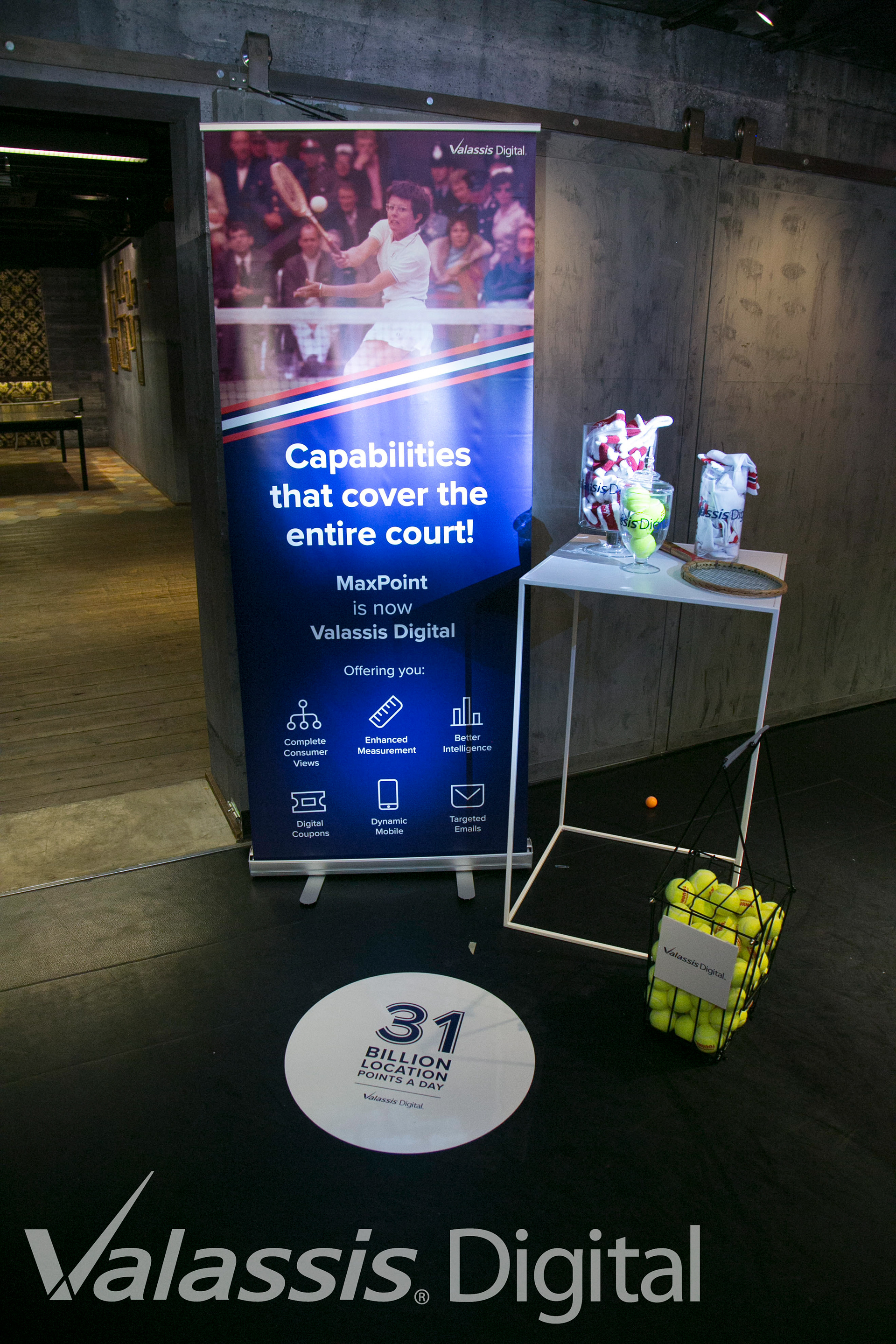
Popup Banners
Scoreboard
Assorted Signage
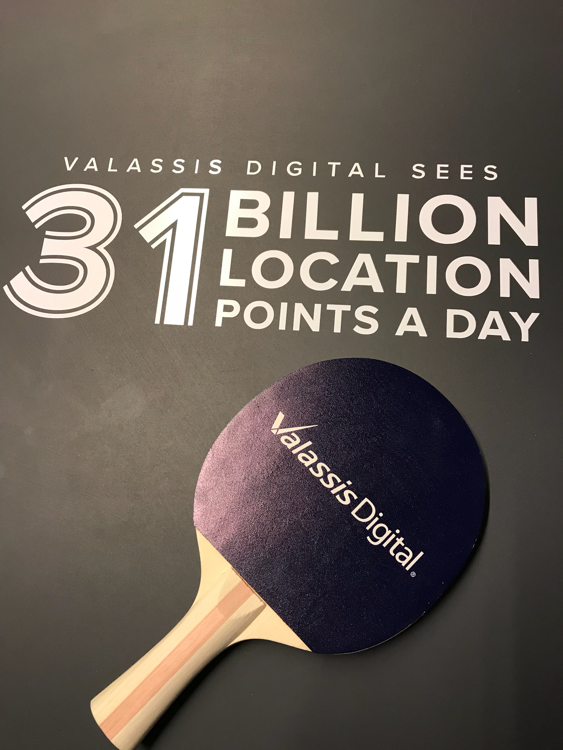
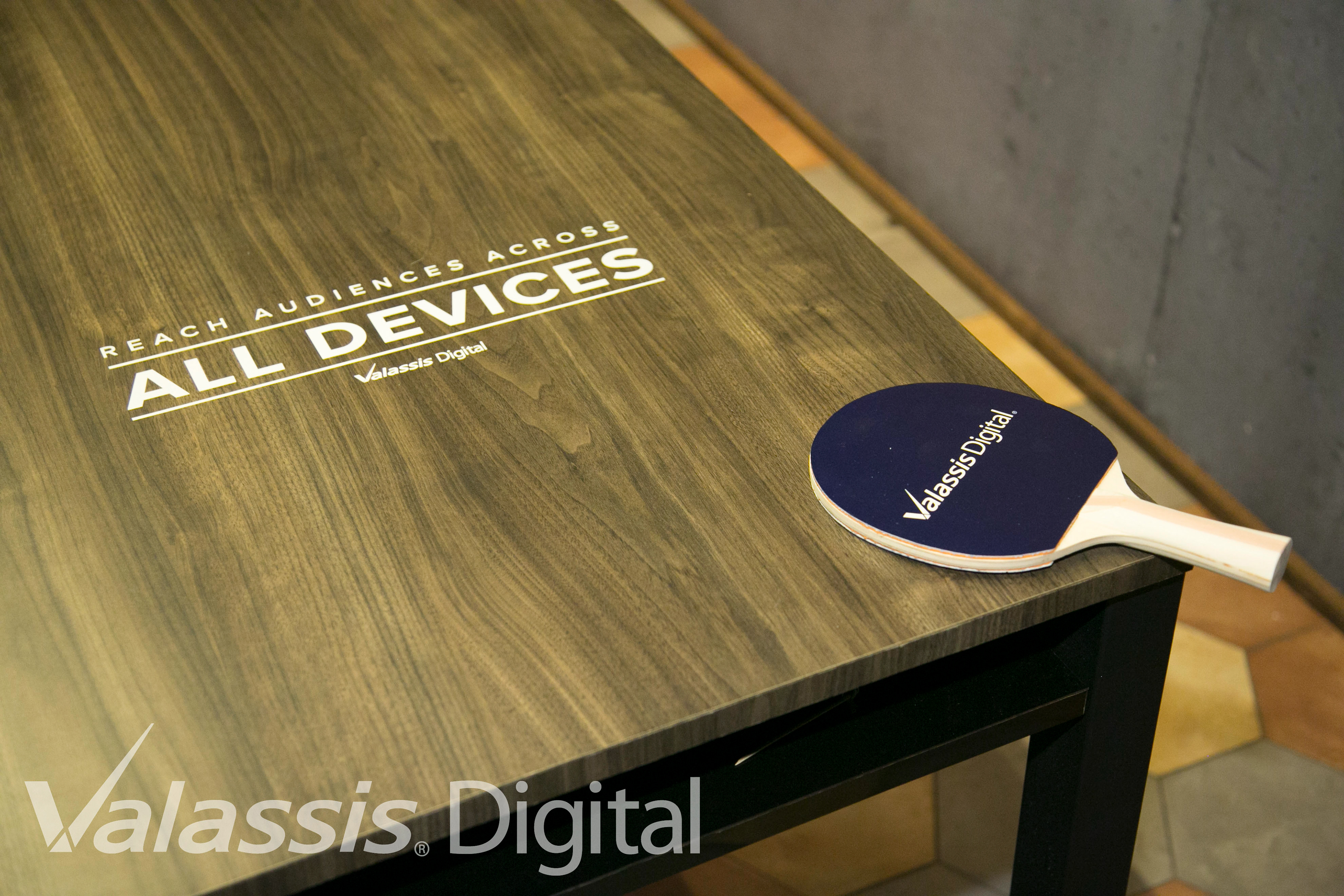
Floor and Table Vinyls
Event Photos
